Mission
Perennial helps artists and designers turn their craft into a business, so they can spend more time making the work because it finally pays for itself. It gives an independent practice the tangible pieces it actually needs, without assuming you speak the language of operations.
Historically, artists and designers have been alienated from modern management tools because of the lack of education and accessibility. Now, there is a tool that exists that helps to guide the way towards financial independence and creative freedom, all in one place.
After a year of consulting for independent artists and small design studios, I realized the potential of a comprehensive software tool that provides education and a platform for business infrastructure.
Perennial is live in beta at app.perennial.design. Log in and check out the app for yourself, or use:
email: demo@perennial.designpassword: PerennialDemo1
Research
The idea started in my consulting work, where every engagement ended in the same place: the work was good, and the operations around it were chaos. A notes app held the project plans, a spreadsheet acted as the CRM, email carried everything else, and the invoicing service ran in its own world.
I recorded interviews with more than a dozen independent practitioners: furniture and lighting designers, ceramicists, textile designers, public artists, people running one and two person studios. The pattern held across every conversation. The craft comes easily to these people. The week quietly disappears into administration spread across a dozen disconnected tools.
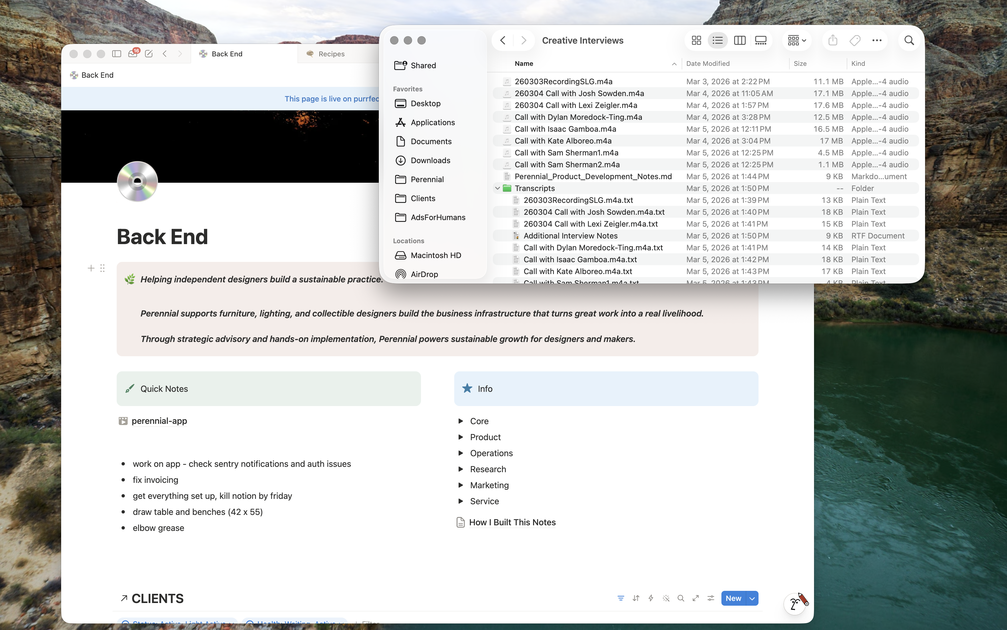
The interviews also mapped the landscape. Tools at the Salesforce end of the spectrum are built for sales organizations and feel absurd at studio scale. Tools at the Notion end hand you raw blocks and leave the system design to you, which is precisely the work a maker wants to hand off. The opening was a tool shaped to how a small studio actually runs: a few clients, a couple of projects at a time, invoices that need to go out, and a reputation to keep building.
The research continues inside the product. Onboarding is a nine step structured interview that asks, in the user’s own words, what is broken right now and what is urgent on their plate. Those answers configure the project board, seed the outreach pipelines, and brief the assistant before the first conversation.
System
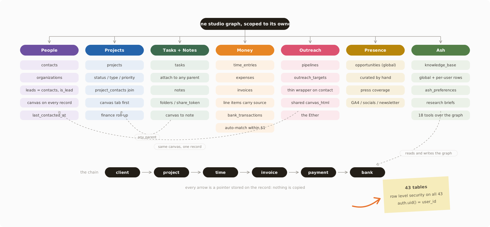
The core decision was to model the studio as one connected graph. A client connects to their projects. Projects roll up time and expenses. Time and expenses become invoice line items. Invoices get paid through Stripe and reconcile against the real bank feed. Because everything lives in one model, every surface shows one true picture of the studio.
The data layer is Postgres on Supabase: 43 tables, with row level security on every one from day one. Each row is scoped to its owner at the database level, which makes the database itself the authorization layer and lets most features read and write it directly. It also means going from one studio to many is a switch. That cost extra work up front for a product with a handful of users, and it was the right trade.
The linking philosophy is provenance. An invoice line item knows which time entry or expense produced it. A bank transaction links back to the invoice that generated the deposit. The Resources module indexes every file where it already lives across the app. Tasks and notes attach to any parent, whether that is a project, a person, an organization, an outreach target, or an opportunity, so a single entry shows up everywhere it matters.
Interface
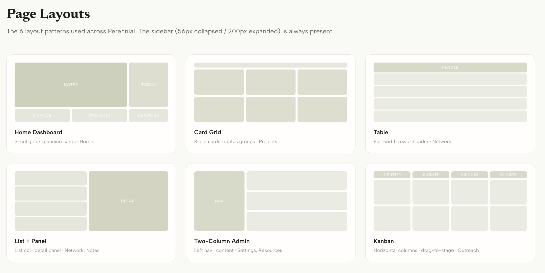
I wireframed before I wrote code: 28 standalone HTML wireframes, built desktop first. Every feature started as three options, I picked a direction, then iterated. The wireframes carried their own annotation system, red for areas still to be designed, blue for decisions to revisit, and used realistic maker content, because “Walnut slab idea for gallery show” reveals things about line length and tone that placeholder text hides.
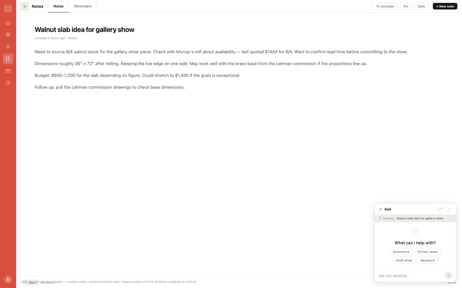
The interface is built on canvases. The home screen is a freeform canvas: your studio at a glance and a space to think. A tool rail on the left carries drawing tools and live studio objects, so a morning of planning can mix sketched shapes, notes, task cards, and calendar blocks on one surface. The greeting, the getting started cards, and the first conversation with the assistant all happen on the canvas itself, and the “Ask Ash anything” bar anchors the bottom of the screen. Makers think spatially and visually, so the software opens the way a studio table does: a thinking surface first, with the database working underneath it.
The canvas idea runs through the whole app. Every project, contact, organization, and outreach target opens onto its own canvas as the first tab, with the structured fields alongside. The canvas is shared where the entities are shared: an outreach target wraps the underlying contact, and writing on one surface writes on the other, so the same knowledge shows up in Network and in Outreach.
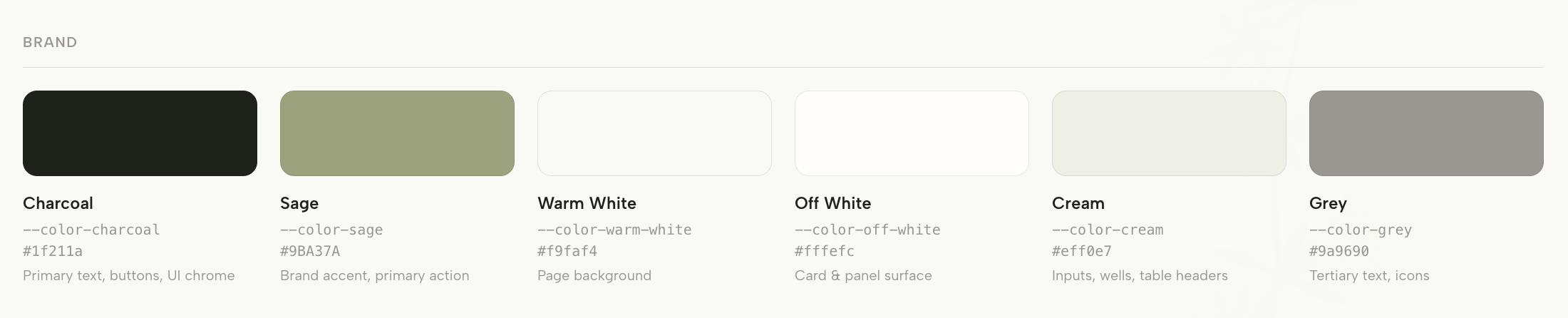
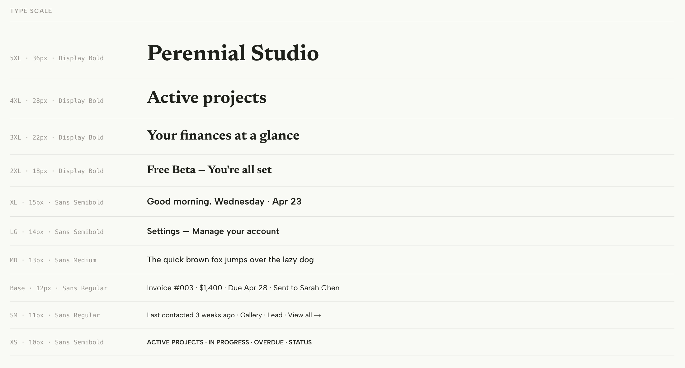
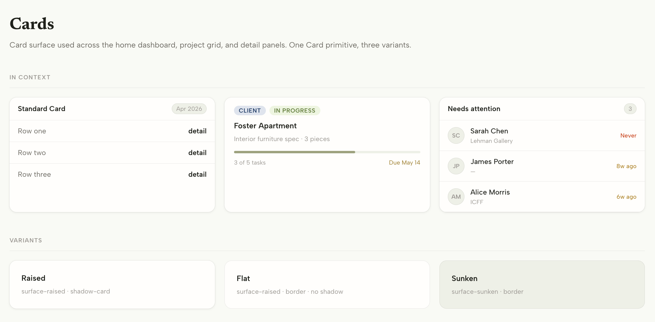
The visual system is charcoal, sage, and warm white, with Newsreader for display type and Albert Sans for the interface, set on a deliberately small and dense scale. User facing labels draw from a fixed palette of ten colors, assigned by hashing the tag’s name, so the same tag renders the same color everywhere, automatically. The design tokens are enforced mechanically: a repo hook checks every edit and requires a token wherever a color appears.
Money
Invoicing runs on Stripe Connect with direct charges, so payments land in the studio’s own Stripe account and the full amount belongs to the studio. An invoice moves from draft to sent to paid, its line items pull from tracked time and expenses with provenance intact, and every invoice gets a public payment page at a tokenized link, plus a printable version and a branded email with a live preview before sending.
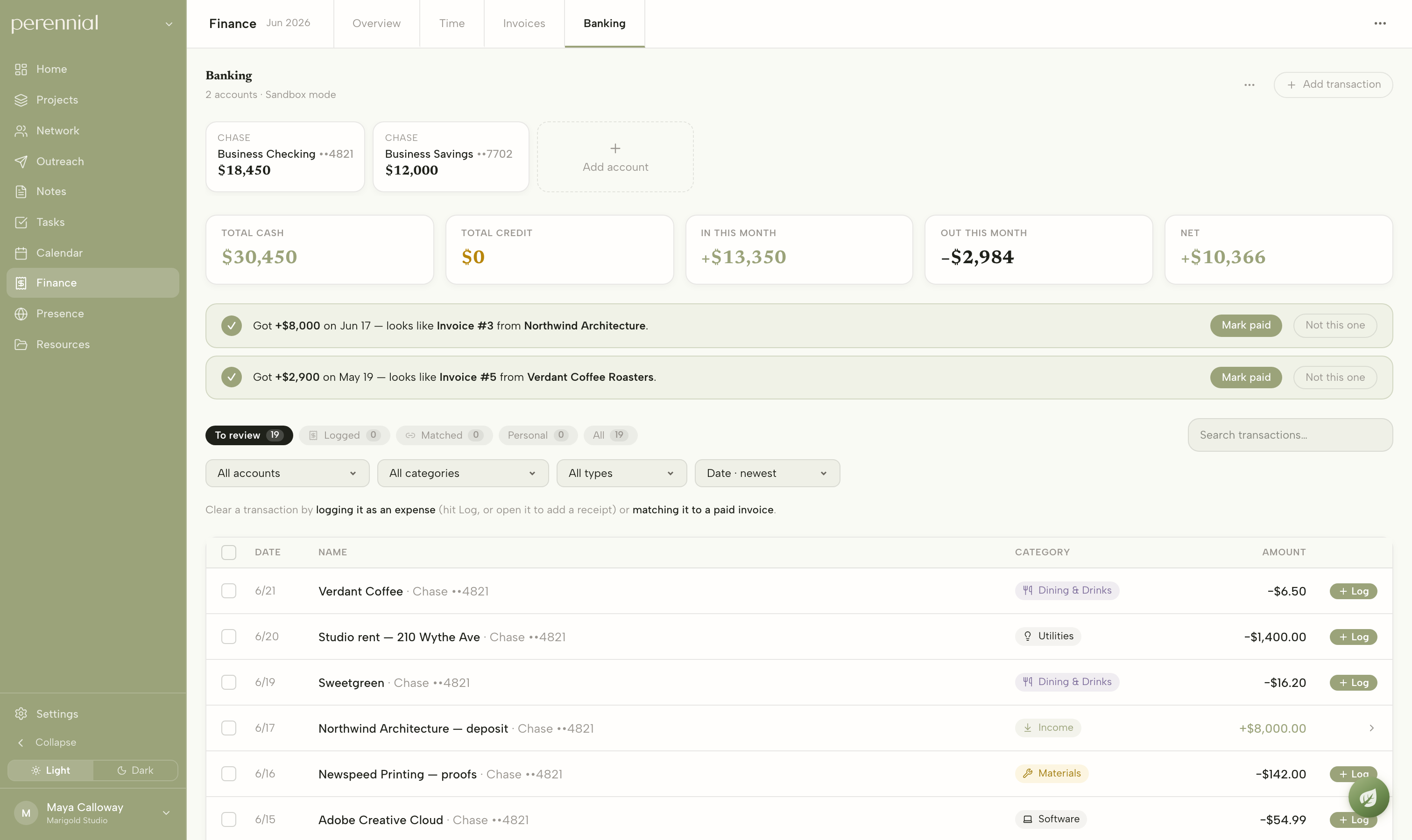
Banking connects through Plaid. Real transactions flow in, get auto categorized, and can carry receipts. When a credit lands that matches an outstanding invoice within a dollar, Perennial proposes the match, which closes the loop from work to time to invoice to actual money in the account. The Stripe webhook is idempotent and returns an error on database failure so Stripe retries, because the money path has to catch every event.
Ash
The assistant is named Ash: one syllable, gender neutral, quiet. The icon is a small sapling, because the assistant’s job is tending a practice so it grows. It rests in the corner and grows through three states, from icon to floating window to full surface, and it lives inside every canvas: press Space at the start of any line and Ash is there. What comes back is either prose inserted into the page or a real action with a link to what it created.
The governing rule is educate, then act. Ash splits questions into two kinds. Factual questions get a direct answer pulled from live data, and every date and dollar amount comes from a fresh read. Nuanced questions, like whether a 50 percent gallery split is fair, get the real options and their tradeoffs, because the goal is an informed maker making their own call. A preference memory learns each user’s stated positions across conversations, and when their preference conflicts with general best practice, their preference wins for them.
Ash’s expertise is built deliberately. A hand written knowledge base covers pricing, contracts, galleries, press, sales channels, and cash flow, written as frameworks that help a maker weigh a decision, then embedded for retrieval. Right after onboarding, a background researcher browses the web for that specific user’s corner of the market, the galleries, fairs, publications, and norms that fit their medium, price point, and region, and writes a private brief that gets retrieved alongside the general knowledge. Advice from Ash is local to the practice it serves.
Two pieces of honesty engineering I care about. Ash’s sense of what it can do is generated from the live tool registry, all 18 tools of it, so its claims always match its actual abilities, and it names its boundaries plainly. And its behavior is tested by LLM judged evals that gate releases at 80 percent. An earlier eval graded answers on containing specific numbers and dates, which trained exactly the false confidence the product exists to avoid, so I replaced it with judged evals of the behavior itself.
Reach
Outreach is kanban pipelines for the campaigns a studio actually runs: press, galleries, stockists, new business, seeded from the onboarding answers. The distinctive piece is the Ether, a parking lot attached to every pipeline. Most outreach goes dormant and comes back months later, so the system gives a paused conversation a place to wait with its history intact.
Presence gathers the outward facing picture: website analytics, socials, newsletter performance, and a press log. Alongside it sits a curated opportunities feed of fairs, open calls, grants, and residencies, reviewed by hand and matched to each user’s discipline, with deadlines flowing onto the same calendar as everything else.
Development
The first commit is April 17, 2026. The last of 462 is July 4. Eleven weeks, solo, every layer from the Postgres schema to the interface. Ash is in the very first build commit, because the assistant was the thesis from day one.
The build ran on a pipeline I would use again anywhere. Slack is intake, where bugs and ideas land. Linear is the queue and the brain. Claude Code is the hands, working each ticket into a branch and a pull request, with a Vercel preview before anything merges to main. A human triage gate sits between intake and the agent on purpose: text from users is untrusted input, and routing it through a person keeps prompt injection out of the code path. Sentry triages errors into the same queue weekly, and a changelog agent posts every merge back to Slack.
Midway through, I wrote an honest document I think about a lot: a duplication registry cataloguing every place the codebase had grown by cloning, down to the four detail panels rebuilding the same scaffold and a Badge component with zero importers. That document drove a consolidation wave, shared shells, adopted primitives, tokenized colors, and finally the hook that enforces the design system on every future edit. Writing down where the codebase was rough made it better faster.
Beta
About ten working designers and artists used Perennial in private beta, coordinated through a Slack where we workshopped the product together. The loop was simple: a user asks a question, I ask what they are actually trying to do, the thread becomes a decision, and the decision becomes a ticket filed straight from the channel.
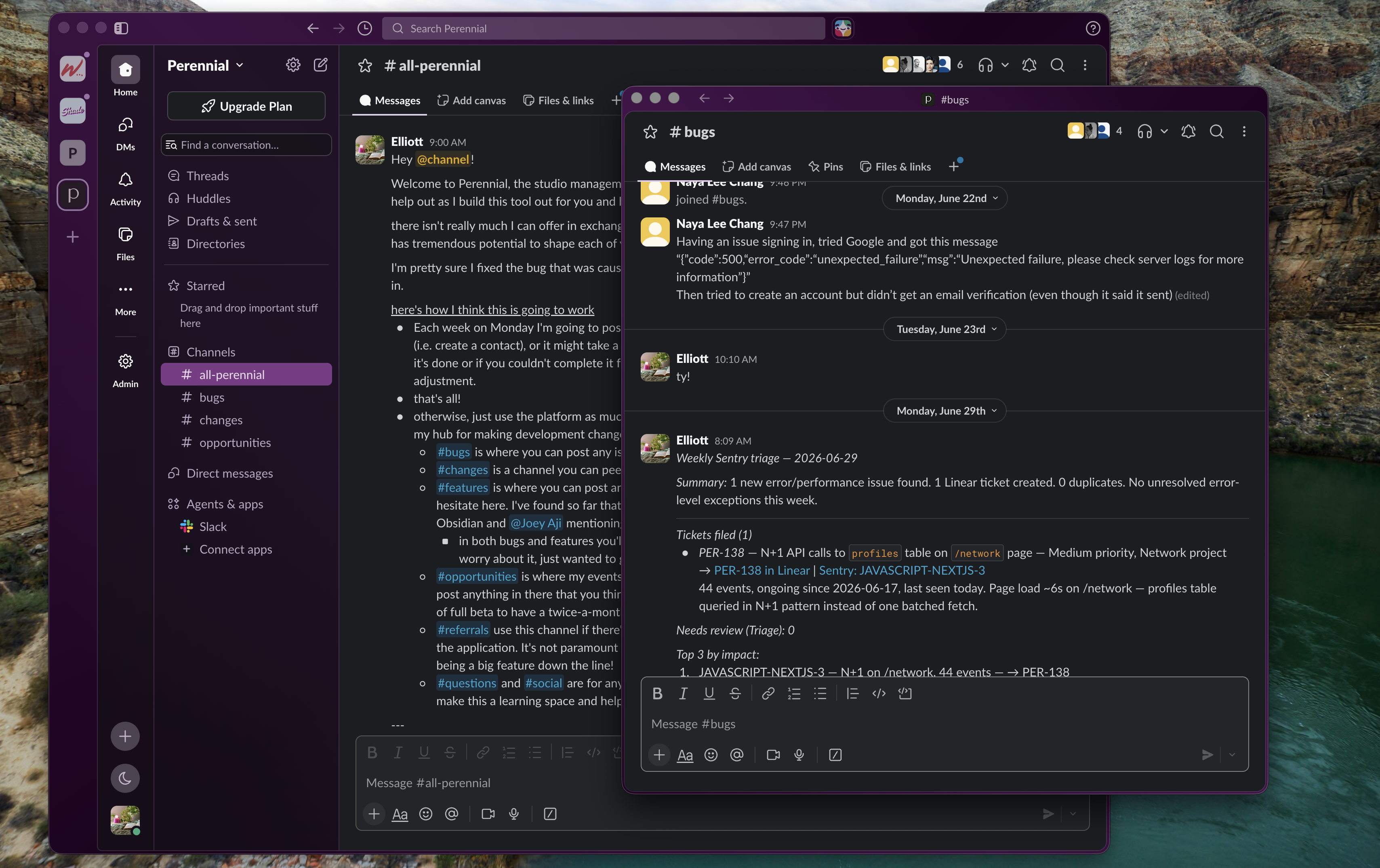
My favorite example is task deletion. One tester wanted to delete tasks, for the ones created by mistake. Another wanted an archive, because a few weeks later a completed task stops mattering day to day while its history still does. Two asks that sound like one feature request are actually the full definition of the feature: deletion serves mistakes, and archival serves history.
Status
Perennial is live at app.perennial.design and usable end to end: onboarding, projects, network, outreach, notes, calendar, scheduling, invoicing, banking, presence, and Ash. I paused active development in August 2026 after a hard look at the market landscape. The beta cohort knows I intend to pick it back up, and the system was built for that moment: multi tenant from day one, documented end to end, with an eval gate waiting for the next change.
What it demonstrates is the way I like to work. Find the disconnected mess, design the system that joins it, and build the whole thing end to end, with the honesty to write down what is rough and the discipline to fix it.